Every so often, it’s necessary to step back and take a look at your books and see what is and isn’t working. After perusing book covers of some current young adult novels, I felt like the covers for the Destroyer Trilogy weren’t quite doing it anymore. The symbols used in the original covers are unique (I designed them especially for the books), but they weren’t really giving readers a good idea of what the books were about. So, I decided it was time for a makeover.
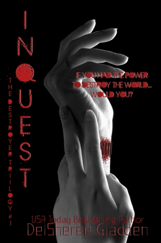
I’d love to hear what you all think of the new covers, featuring Libby’s fateful diktats on the cover of book one, Inquest…
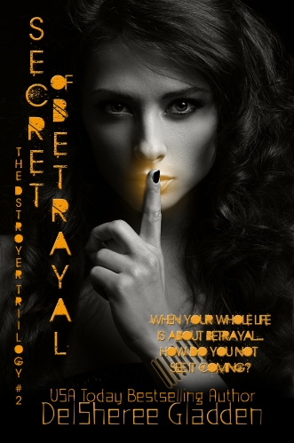
…the promise of one of the worst betrayals Libby has had to face…
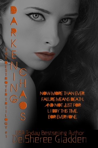
…and the promise of unimaginable chaos.
If you liked the symbols from the previous covers, have no fear, they’ll still be there on the back cover, slightly redesigned as well…
If you’d like to grab a copy with the new covers, you can find them all here…
Inquest
Secret of Betrayal
Darkening Chaos
Connect with me online:
Facebook: AuthorDelShereeGladden
Twitter: @DelSheree
Pintrest: DelSheree
Google+: DelSheree Gladden


I like the images. It definitely comes across as more mature, if that’s what you are looking for. But I have to say that I’m not crazy about the font. The filled-in closed letters make it difficult for me to read at a glance, and even when I stop to read the words, I have to be very particular in reading, rather than an average read. The big, solid splash of color draws my eye, and I have to work against that in order to see the actual letter.
LikeLiked by 1 person
Thank you for your comments, Daniel! Picking a font is always such a pain, lol! It’s never quite what you’re picturing 🙂 I think on some areas I may have to go in and manually add spaces so they’re easier to read. It would be nice if some of the fonts were easier to edit directly. I’m glad these have a more mature feel now. I feel like they better represent what’s going on the story and what Libby has to face.
LikeLike
Oh, yeah! Fonts are an art form in themselves! I do a lot of poster designing for a local theatre company and I can spend as much time choosing a font as I do on the rest of the project!
Even if you don’t completely clear them, but soften the centers so that they are not as bold as the letter, I think that would help tremendously.
LikeLiked by 1 person
Thank you for the suggestion! I’ll try softening the centers and see if that helps it to be more readable 🙂
LikeLike